Choose language
Brand Guidelines
Updated: januari 01, 2026

Logo

Elari-logo-animation

Display mode

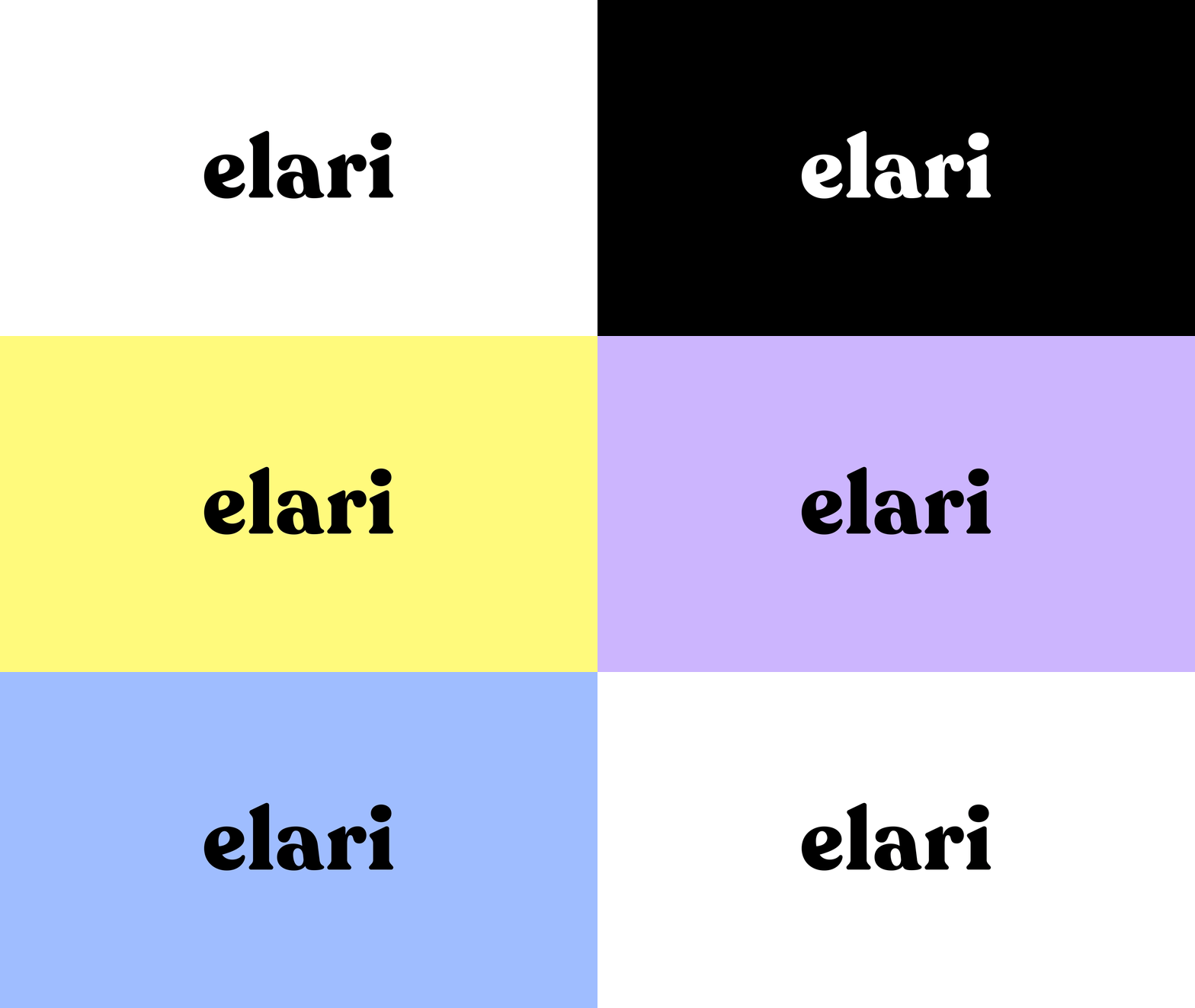
The logo serves as the main identifier of the brand and plays a key role in its visual identity. It should remain clear and readable across various contrasting backgrounds. Therefore, we recommend using the appropriate logo variations for light and dark backgrounds, as illustrated below.
Elari-logo-positive

Logo - light background

Elari-logo-negative

Logo - dark background

Safe area

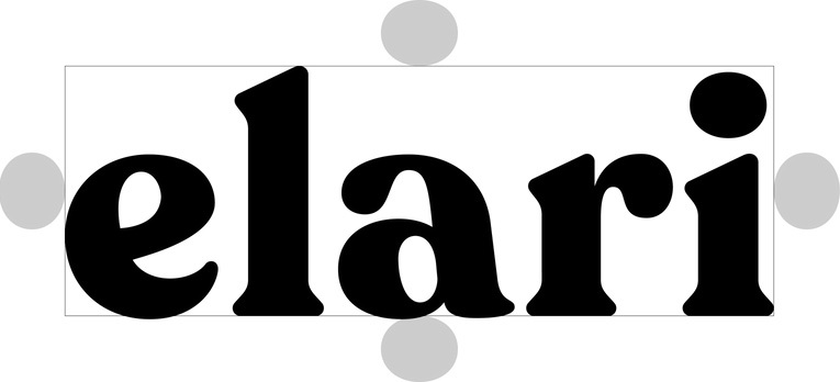
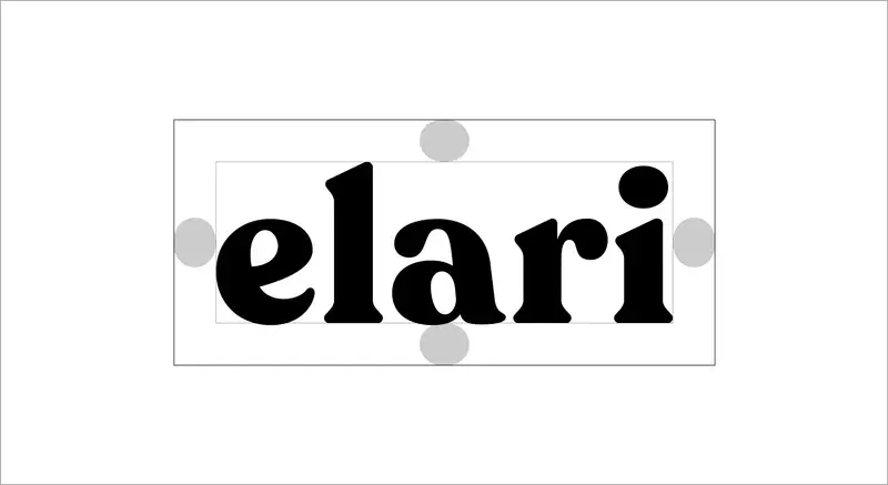
This is the minimum space that should not contain any graphical element so the logo can stand out. When the logo is standalone aligning it like this makes it optically centered.

logo-margins

Logo - light background

logo-margins2

Logo - dark background

💾  Logo's ready for download can be found in Stockpress.

Favicons

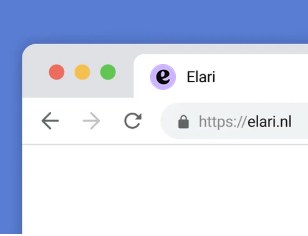
We use the favicon icons to assist users in identifying a website among various open tabs or saved bookmarks. They also can be used in social media and email profile pictures.

elari-browser-favicon

Favicon

Screenshot 2026-03-16 at 13.40.56

Social media profile picture

Screenshot 2026-03-16 at 13.41.04

Email avatar

💾  Favicons and Avatars ready for download can be found in Stockpress.

Mobile icons

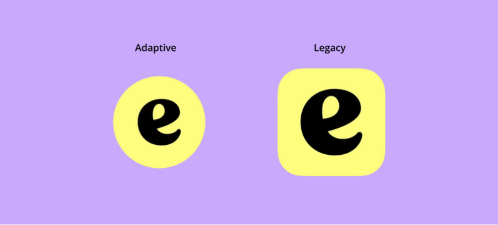
Most of the time we need a little help to be able to identify an application and perform tasks on the mobile phone. This help is often represented by graphic elements that provide visual communication about the mobile app or brand without the need to elaborate in words. App icons are among the most crucial communication tools and play a significant role in promoting the app on both the App Store and Google Play.
Screenshot 2026-03-16 at 13.54.02
i
Get the app icon Assets from this package.
💾  App icons ready for download can be found in Stockpress.

Vignette

The vignette can be used to provide a glimpse into the brand's background without the need for extensive dialogue or exposition. It conveys a brand's values and evokes emotions in a short time.

In progress...

v51cqKTYcw19JEKZM2oa
Do

Use the logo exclusively on the backgrounds that provide optimal contrast to maintain clarity and coherence of the visual identity.

thmrsgfGb6dc8pfW34X6
Do

Use the alternative white version of the logo for dark backgrounds. This ensures readability and visual consistency of the brand identity.
dHAFHWreUB23vpppzqFE
Do

Always respect the minimum safety area.
tBWPzPdu2ugTY5SBHAGU
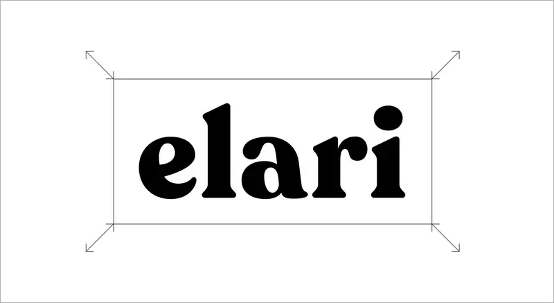
Do

Maintain the aspect ratio when resizing.
YBcRXauRNqDvRrsWiBvh
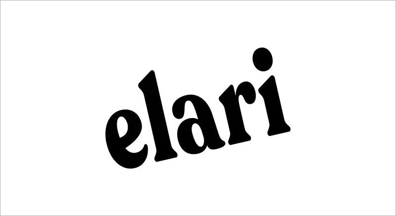
Don't

Distort, rotate or warp the logo in any way.
qHH4jyq7p87hDDKhePSe
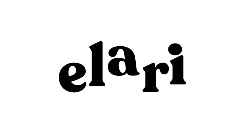
Don't

Rearrange or alter the shapes in the logo.
QdDdxA8auVCTpKhseijs
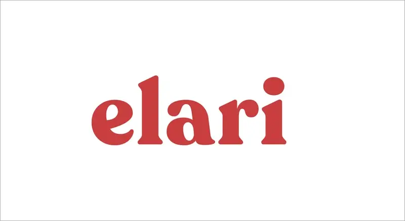
Don't

Change the colours of the logo. Use only the ones listed in the style guide.
a3yKEe9YfnY2NuVVmr5q
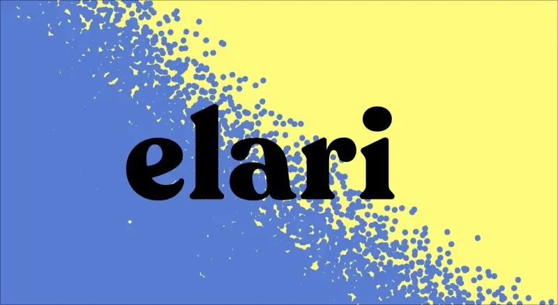
Don't

Place the logo on a noisy background. Always make sure it is readable.