
Logo
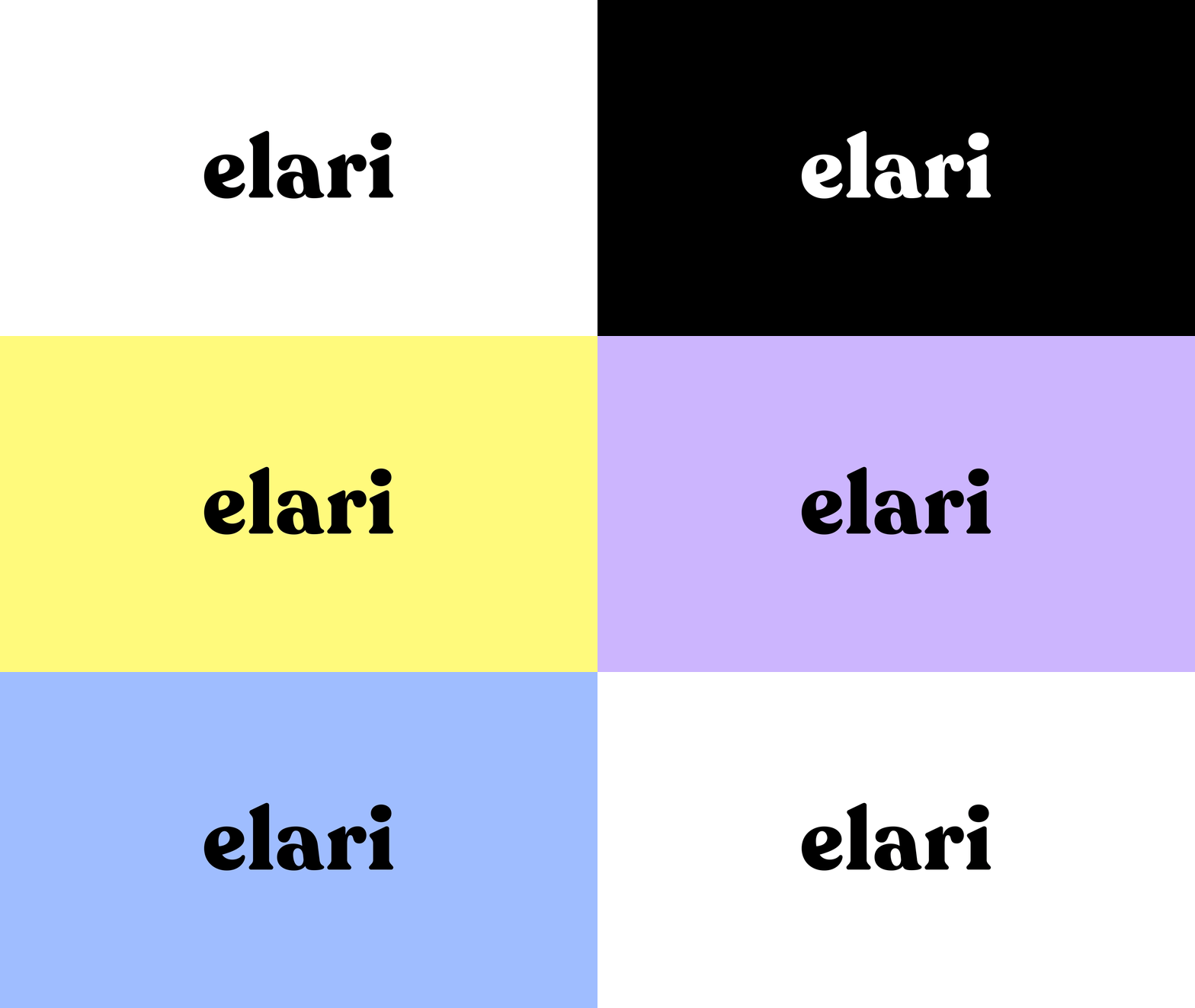
Display mode
Logo - light background
Logo - dark background
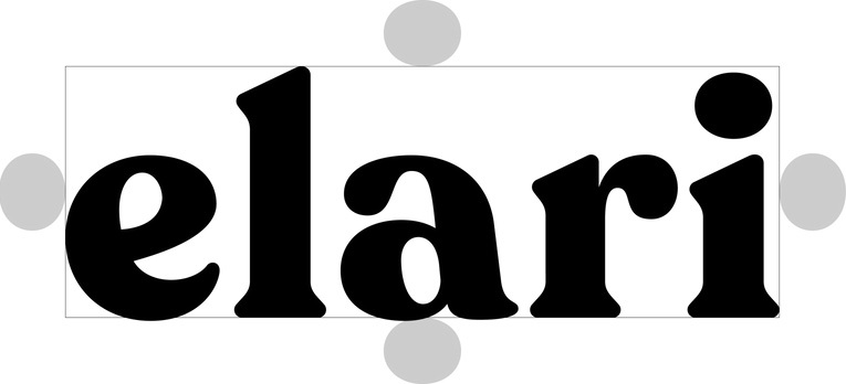
Safe area
Logo - light background
Logo - dark background
Favicons
Favicon
Social media profile picture
Email avatar
Mobile icons
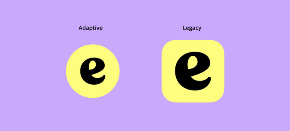
Get the app icon Assets from this package.

Do
Use the logo exclusively on the backgrounds that provide optimal contrast to maintain clarity and coherence of the visual identity.

Do
Use the alternative white version of the logo for dark backgrounds. This ensures readability and visual consistency of the brand identity.
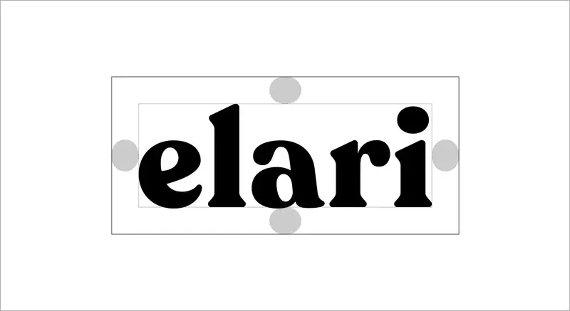
Do
Always respect the minimum safety area.
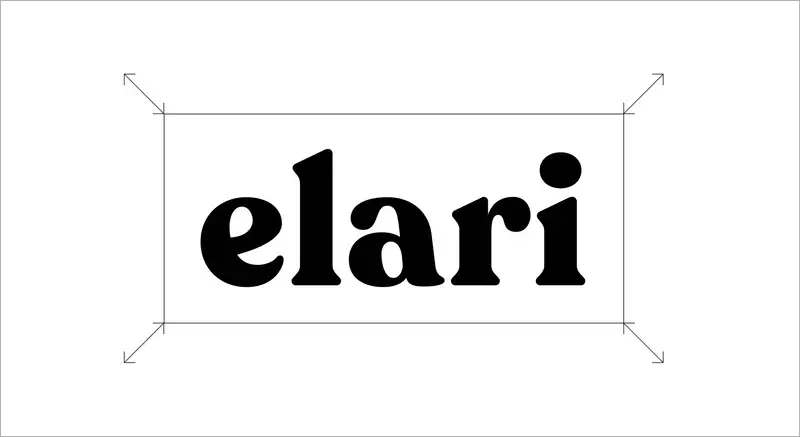
Do
Maintain the aspect ratio when resizing.
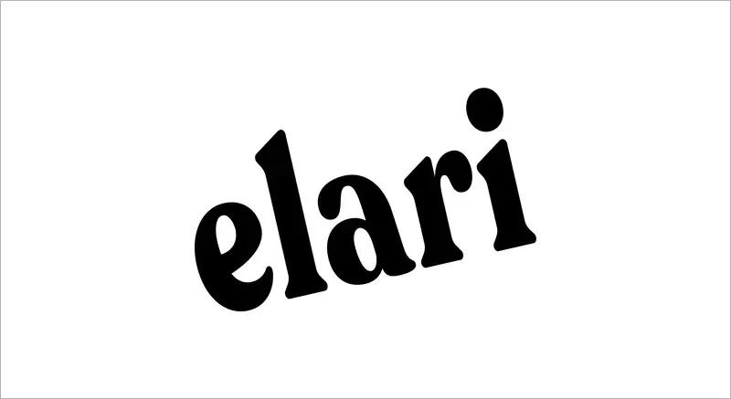
Don't
Distort, rotate or warp the logo in any way.
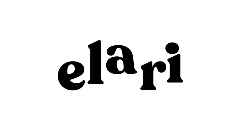
Don't
Rearrange or alter the shapes in the logo.
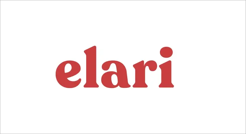
Don't
Change the colours of the logo. Use only the ones listed in the style guide.

Don't
Place the logo on a noisy background. Always make sure it is readable.